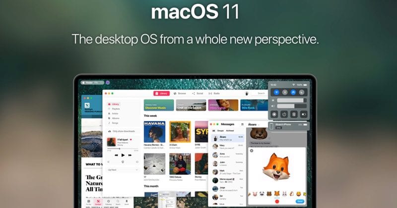
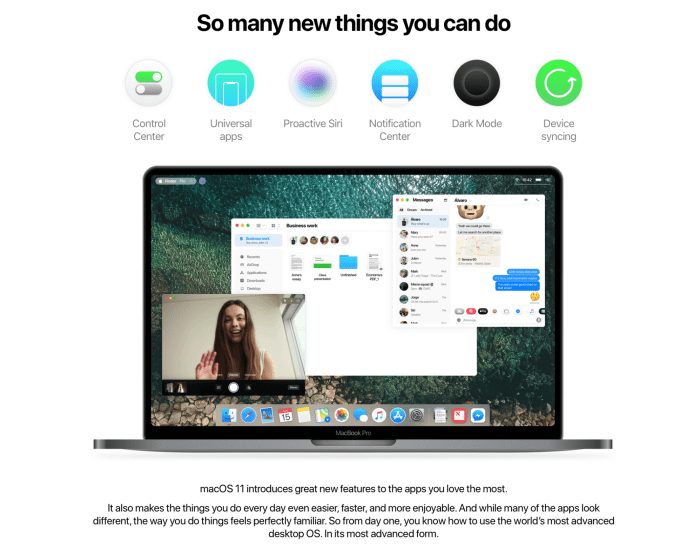
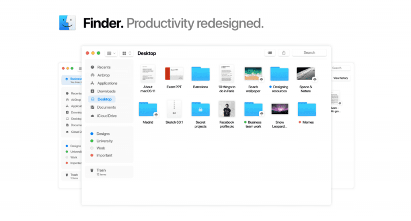
Recently a concept of design created by Alvaro Pabesio has appeared that shows the great changes that can occur this year in macOS when the next version will be presented.
macOS: We should expect big changes
In these new concepts, almost everything has changed. The first major change to notice is in the classic menu bar of macOS which now appears much more streamlined. And instead of the Wi-fi and sound icons popping up at the top, they’re gathered in a control centre on the right which, quite possibly, when clicked expands. For everyone who uses iOS, this control centre is certainly quite familiar.
But despite all this, according to the rumours that have circulated, the applications should be the big focus of the tech giant Apple in this update of the operating system for Macs. Based on the recent information reported by Bloomberg, these drafts show that macOS is able to natively support and run applications developed for iOS, without putting aside any functionality.
Universal applications?
Universal apps should work on a Mac computer, just like they would work on an iOS device. And, best of all, it’s not worse or lighter versions, quite the opposite. They are even faster and much more versatile. The content adjusts to scale automatically and takes into account the resolution of the screen. It’s still unclear if the tech giant Apple will merge the MacOS and iOS app stores or whether it will keep them separate.
Either way, the tech giant Apple does not want to fuse its two most popular operating systems into one. The idea is to give macOS users the possibility of having the same applications of their mobile devices on the Mac. In fact, in these images, we can see the Messenger application in the macOS dock.
Many other features
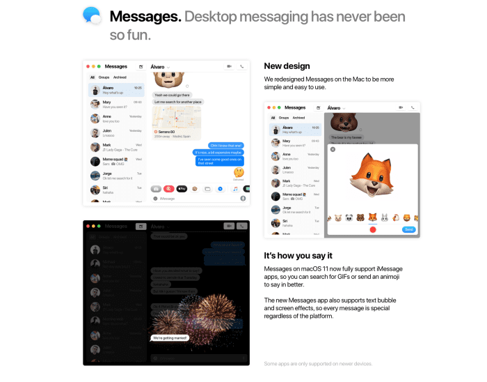
A lot of people would like to have a dark mode, and in the past, there were sketches of Apple operating systems that had this feature. In this aspect, this concept of design is not different from the previous ones and also tries to imagine how it could be the new version of the macOS if a dark mode is included.
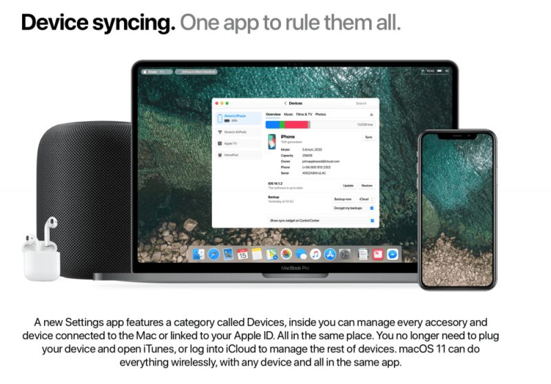
In addition, this concept shows a window called “Devices” and should allow you to manage various Apple hardware devices, including the iPhone, HomePod, AirPods and more. This feature would be very convenient as it allows you to view the statuses and identify information for all Apple products that the user has in one place.
Finally, this new design concept also shows us changes in popular macOS applications, such as the Finder with a new sidebar and a new Messaging app with Animojis.
Conclusion
This is undoubtedly a very ambitious and quite interesting conceptual project that has all the features to make the macOS operating system even better and to explore new features. Among all these things, what stands out most are the universal applications that have the ability to redefine the way an Apple user uses all their devices. WWDC is due to take place in early June and the tech giant Apple will unveil all the new software it has been working on. So, what do you think about this? Simply share all your views and thoughts in the comment section below.
Δ
